A pricing page is one of the highest-stakes screens in any SaaS product. It's where curiosity either becomes a conversion or quietly walks out the door. For Brighter Vision, we needed a page that didn't just display plans. It needed to earn the client's decision.
Potential customers landing on the pricing page were getting numbers without context. Without a clear structure to guide them through the options, it was easy to hesitate, second-guess, or leave without acting. A great product was losing ground at the finish line.
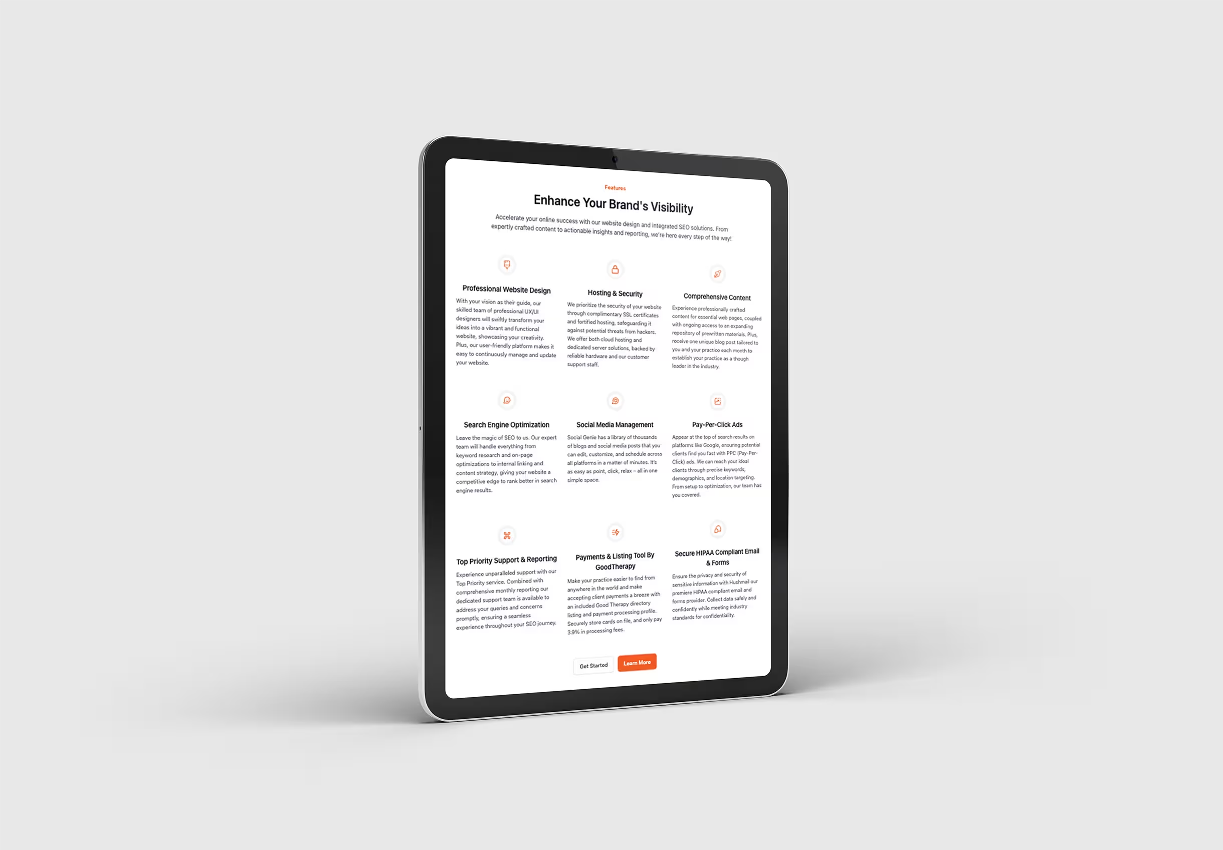
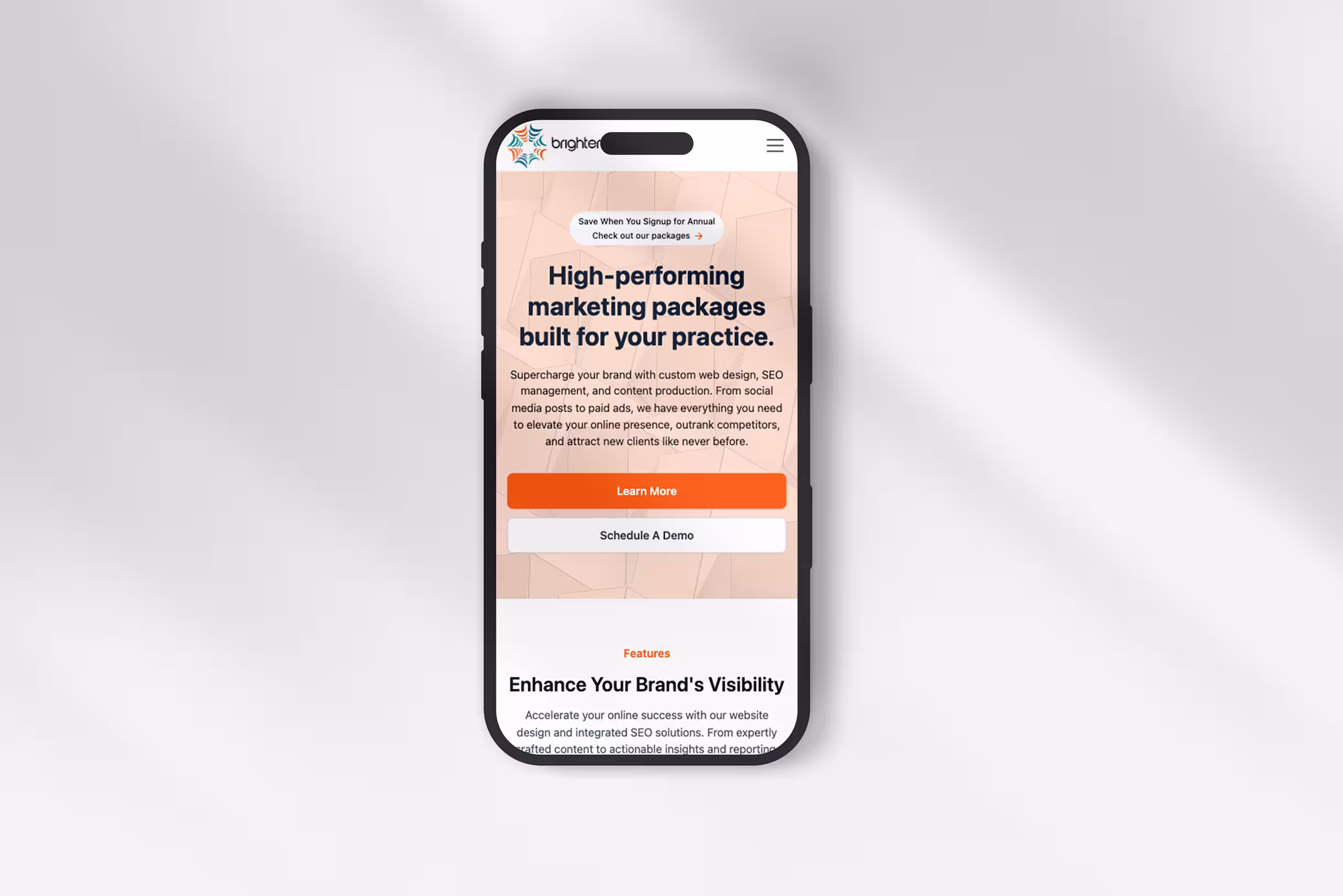
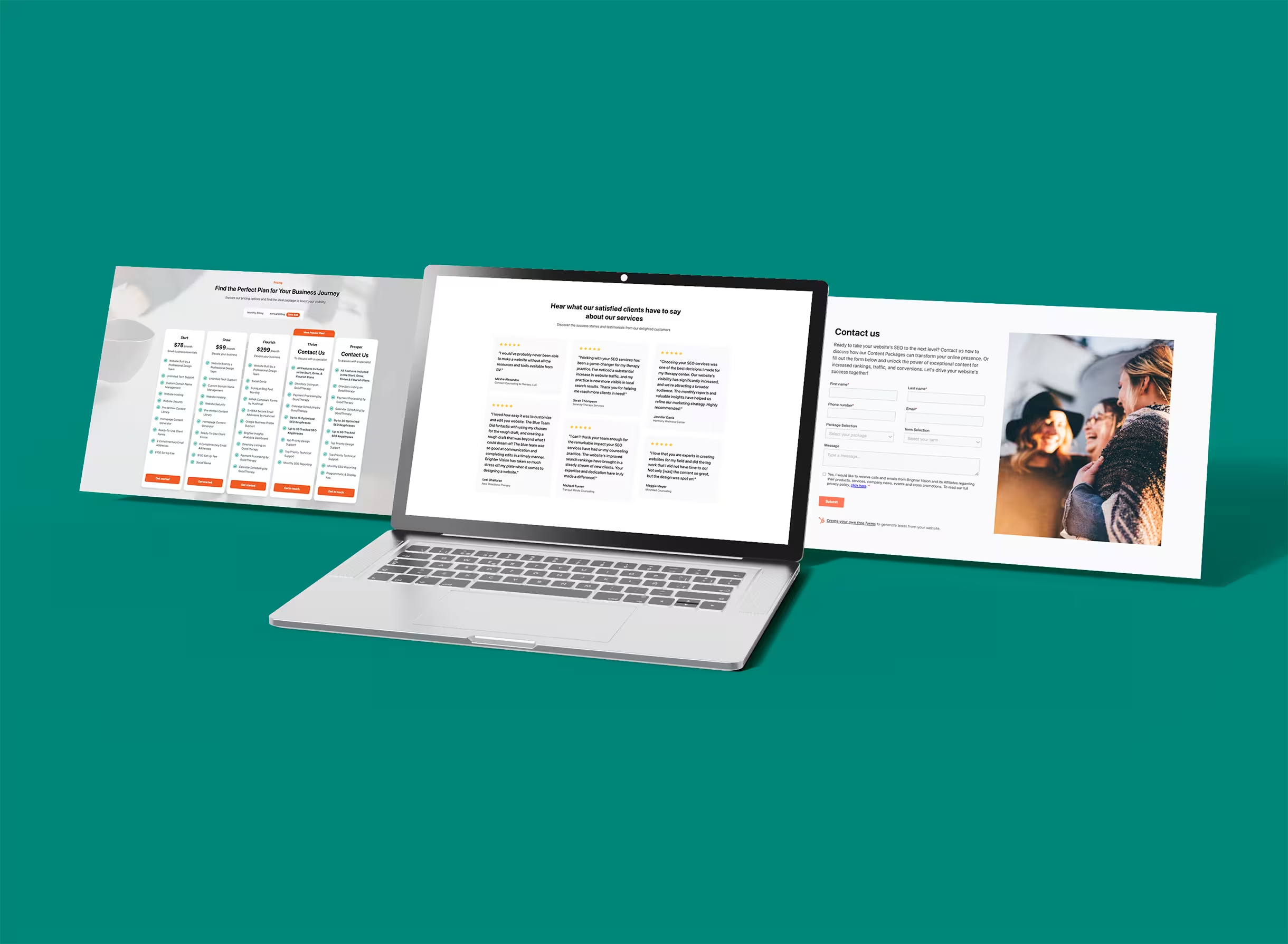
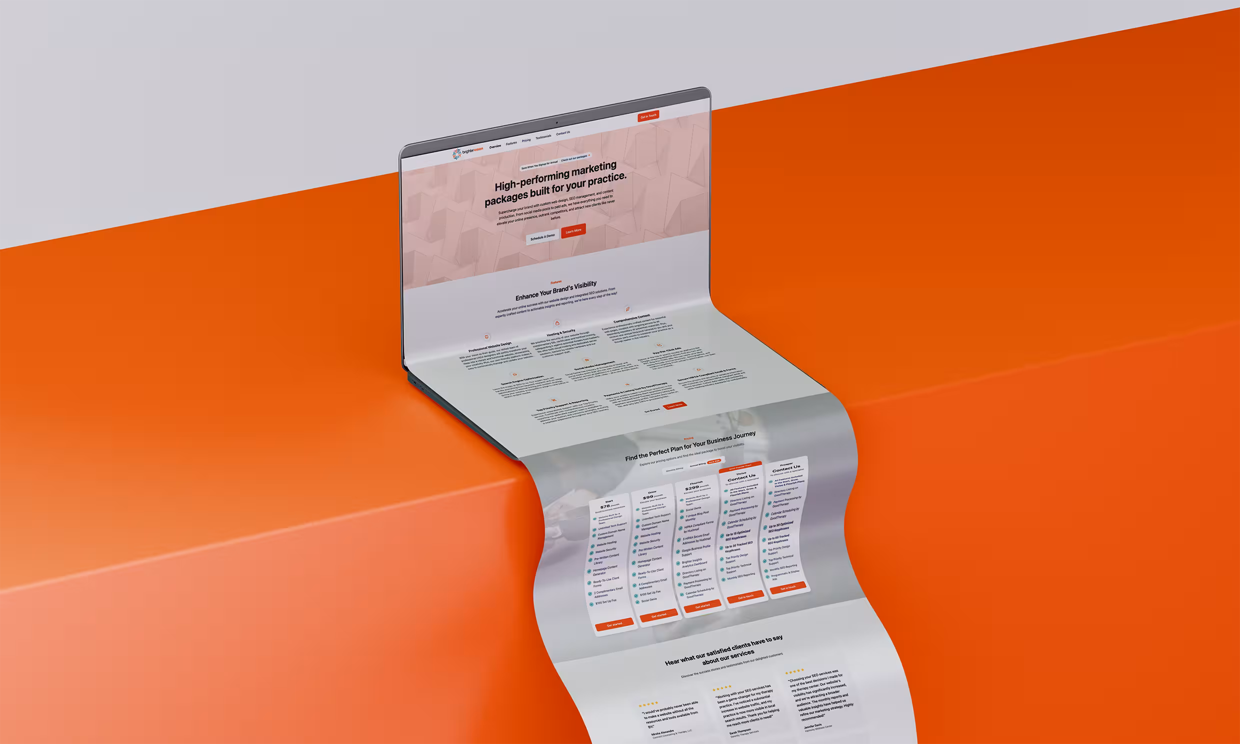
Build a pricing page that sells itself. That meant making plan differences immediately obvious, reducing the mental load of comparison, and giving visitors the confidence to move forward. Trust signals, smart CTAs, and a frictionless layout all had to work together toward one outcome: sign-ups.
A clean, conversion-focused pricing page that guides users rather than just informing them. Plan differences are scannable at a glance, testimonials and guarantees do the heavy lifting on trust, and CTAs are placed where the decision actually happens, not as an afterthought. Fully responsive, accessible on every device, and built to perform.