When a firm with over 30 years of history starts over, the new brand has to carry that weight without looking like it's carrying it. CA5 Surveying and Mapping launched in 2025 and needed an identity that felt established and credible from day one, without leaning on previously established business.
A new company in a highly specialized, trust-driven industry doesn't get much runway to make a first impression. Surveying and mapping clients, whether they're developers, municipalities, or homeowners navigating fire rebuilds in Malibu or Pacific Palisades, need to know immediately that they're working with professionals. Starting fresh meant the brand had to do a lot of that credibility-building on its own, before a single conversation happened.
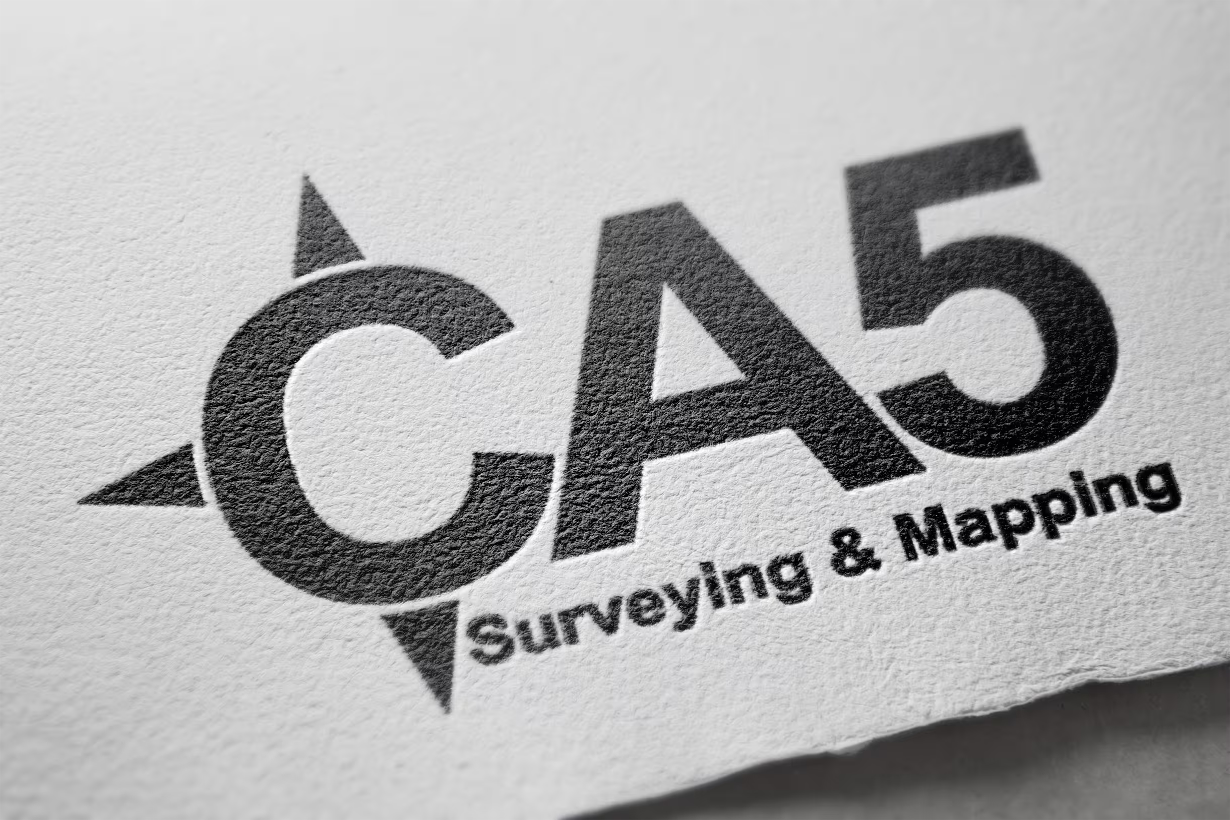
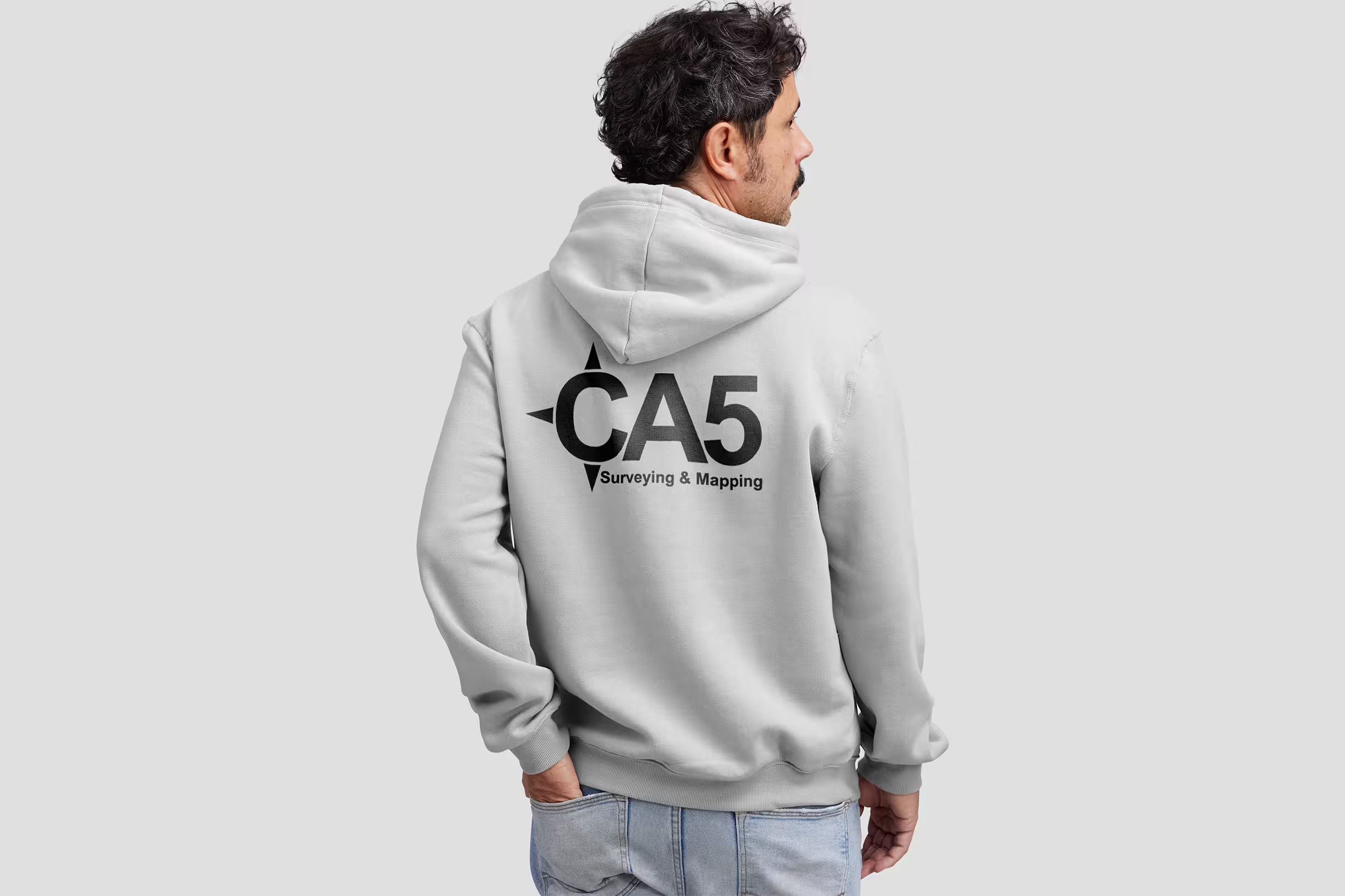
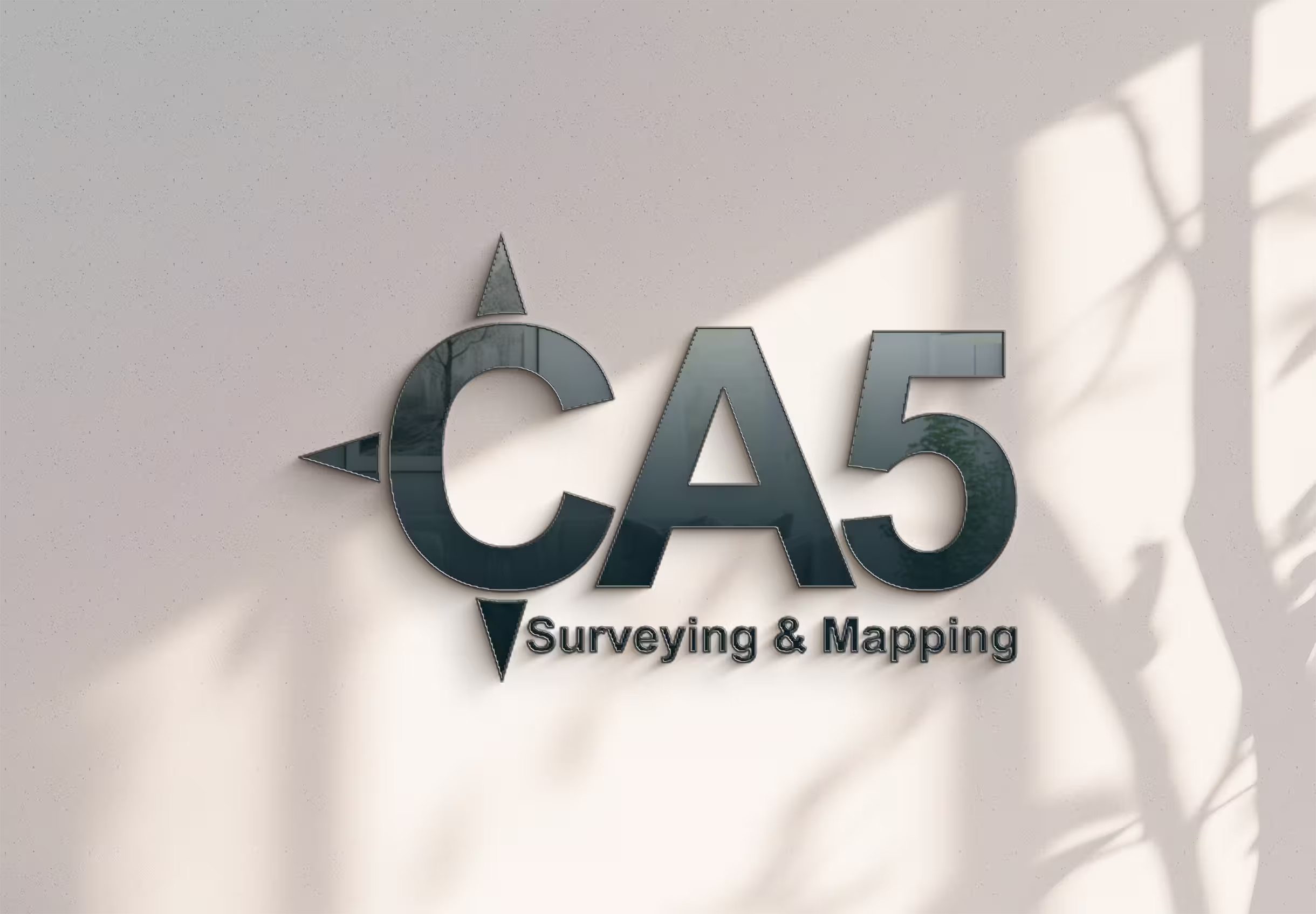
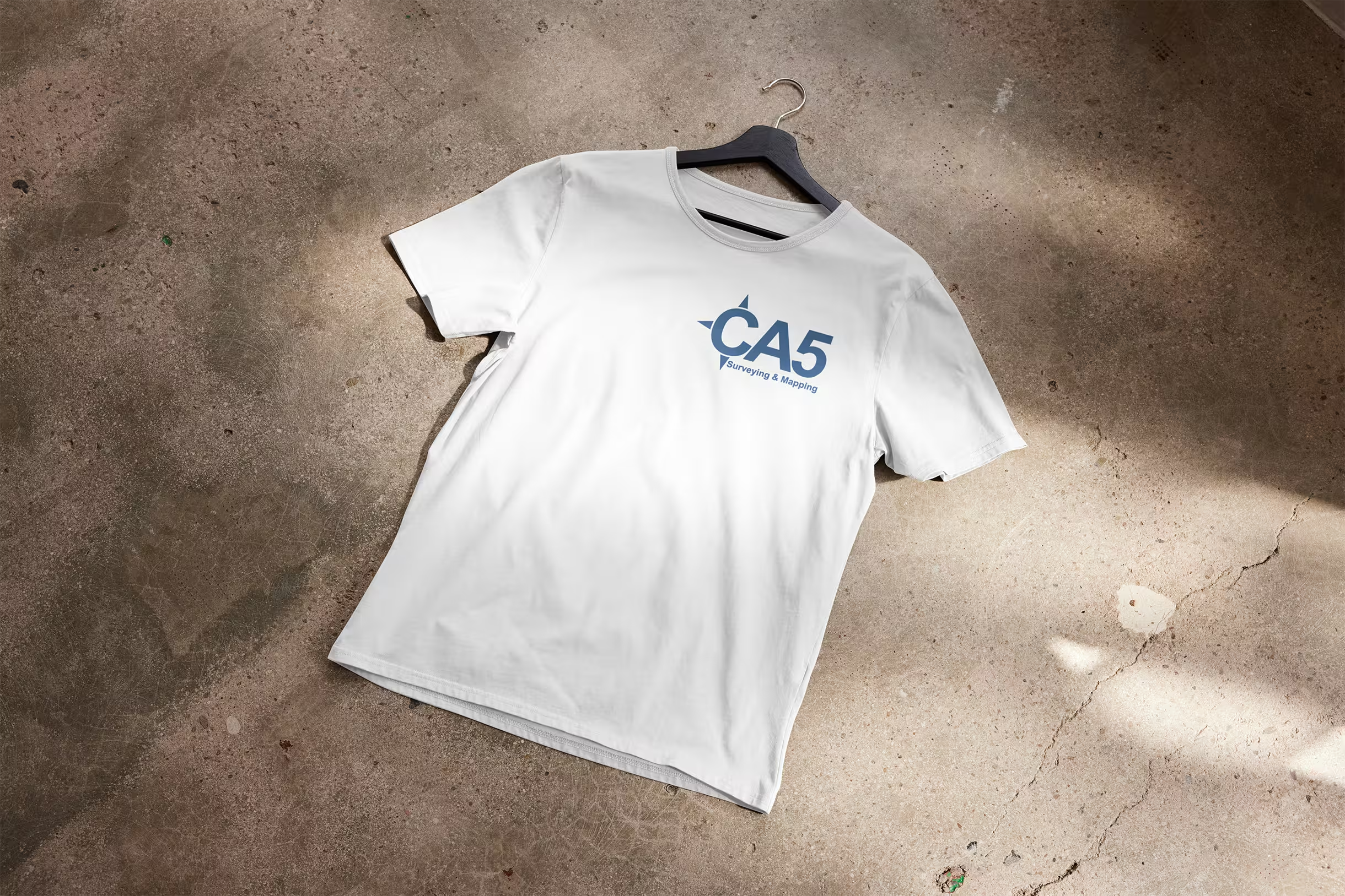
Create a logo and brand identity that positioned CA5 as a modern, professional firm while honoring the depth of experience behind it. The mark needed to feel precise and grounded, reflecting the nature of the work itself, and hold up across the range of contexts a surveying company operates in, from job site signage to professional proposals.
A clean, confident brand identity built for a company that knows exactly what it's doing and looks like it. The logo is precise without being stiff, professional without being generic, and built to represent a firm that's already hitting the ground running in some of the most in-demand rebuild markets in Southern California.