Some projects are a grind. This one was just fun. A millennial soup pop-up with a name that stops you mid-scroll, a chef-owner with a clear creative spirit, and a blank slate for branding. That's a good brief. From first sketch to final variations, this project was exactly the kind of work that reminds me why I got into design in the first place.
The client came in with a killer name and a direction that, on the surface, sounded clear: high-end, turquoise, pink, and mint. But once we got into the discovery conversation, it became obvious that those choices were a starting point, not a destination. What they actually wanted was something that felt hand-made, boutique, and a little rough around the edges. A brand that matched the personality of the chef behind it and the food they were planning to put in front of people. The initial color palette would have told the wrong story entirely.
Create a brand identity for a soup pop-up that captures the warmth, creativity, and DIY spirit of the concept. Something built for Colorado street fairs, weekend markets, and pop-up events later this year. It needed to feel approachable and fun without feeling cheap, and distinctive enough to stand out in a crowded outdoor vendor environment.
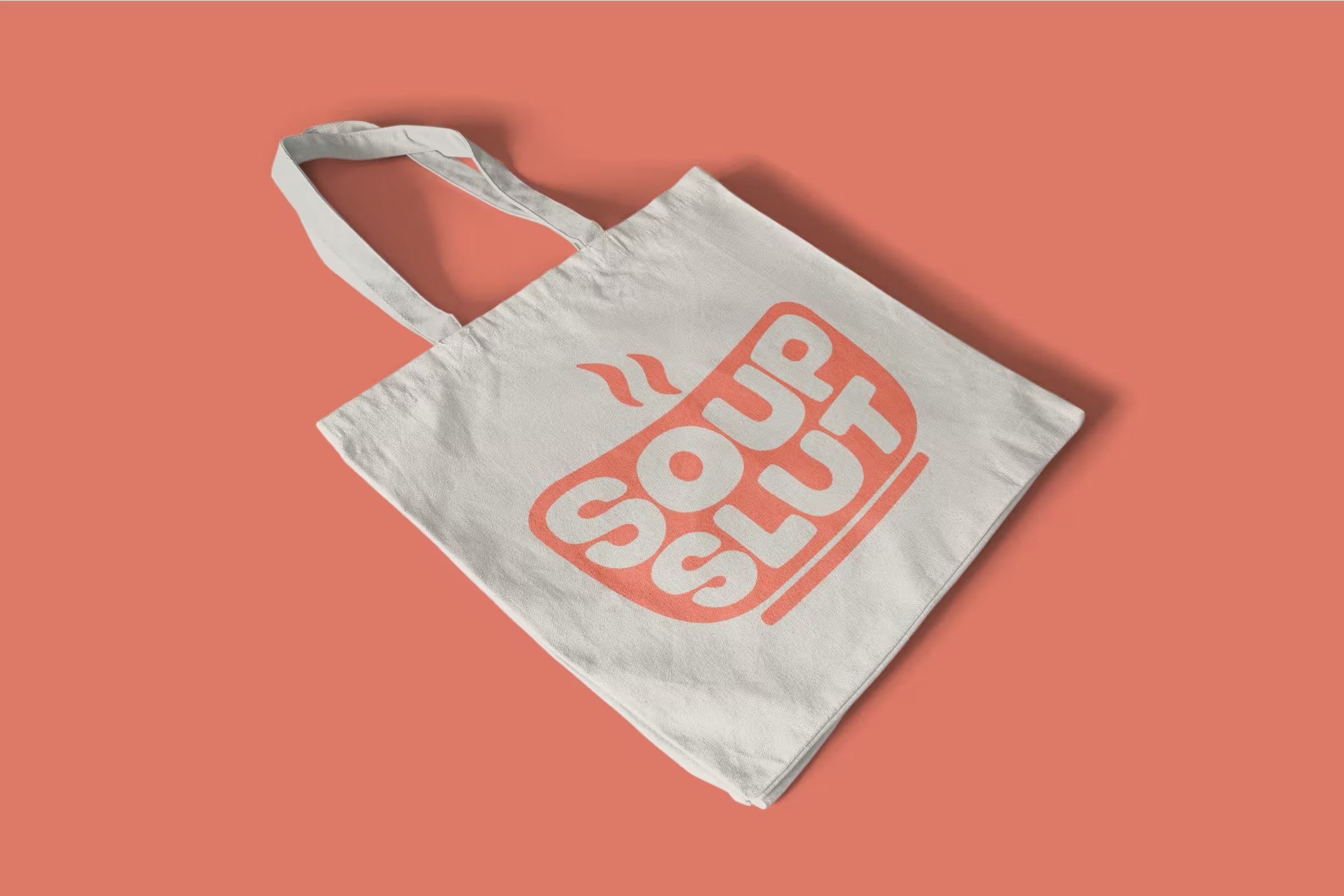
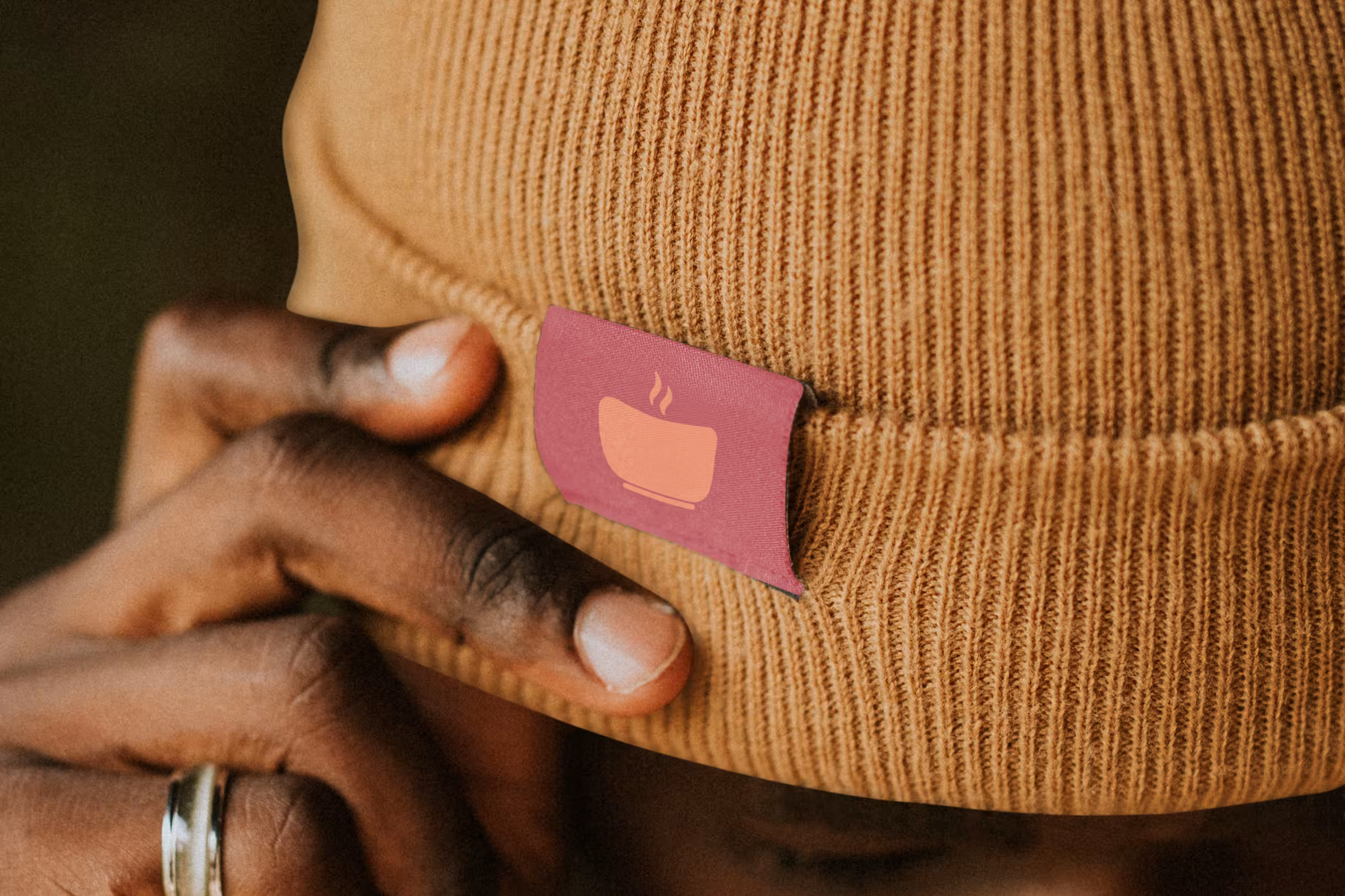
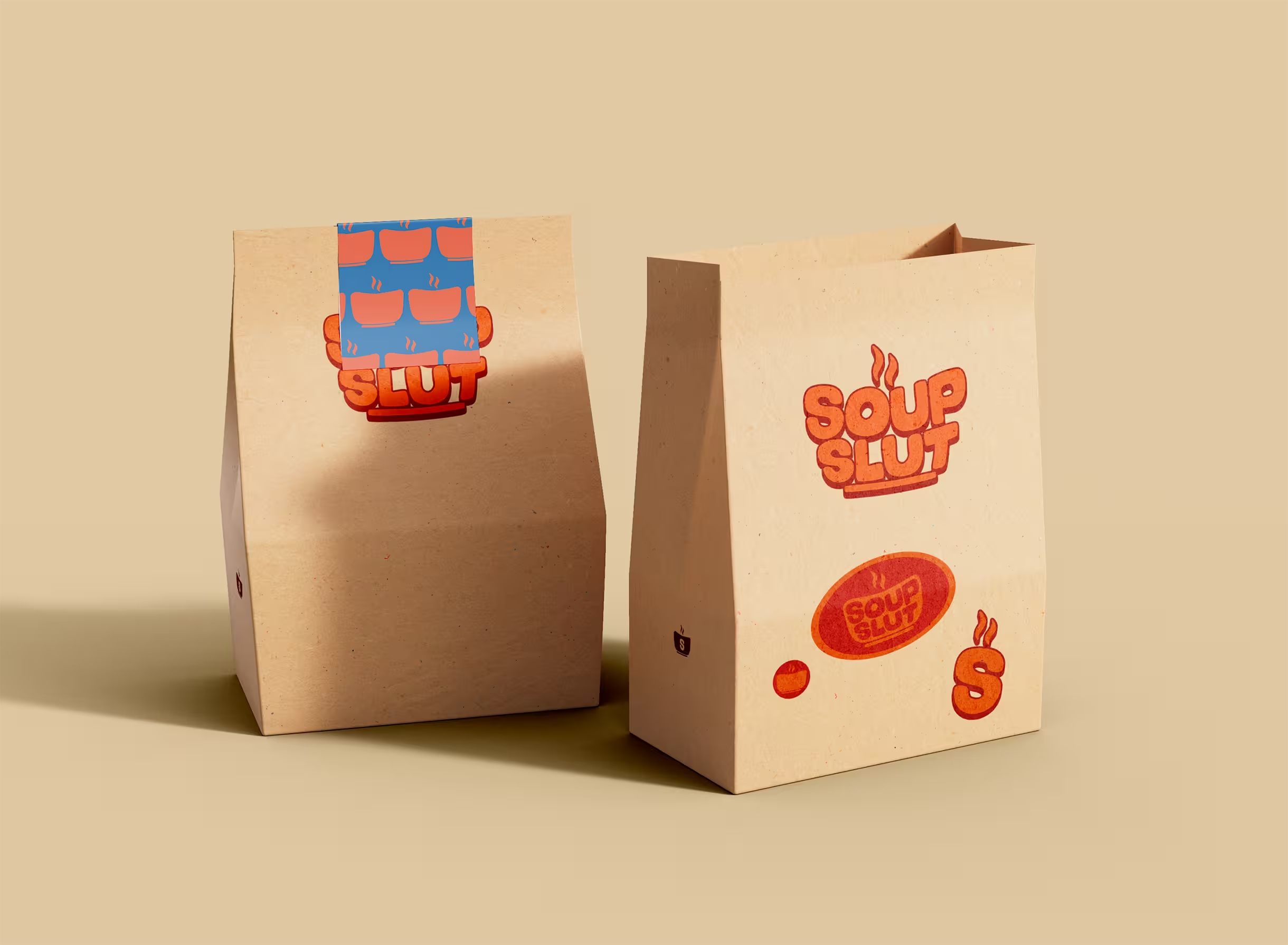
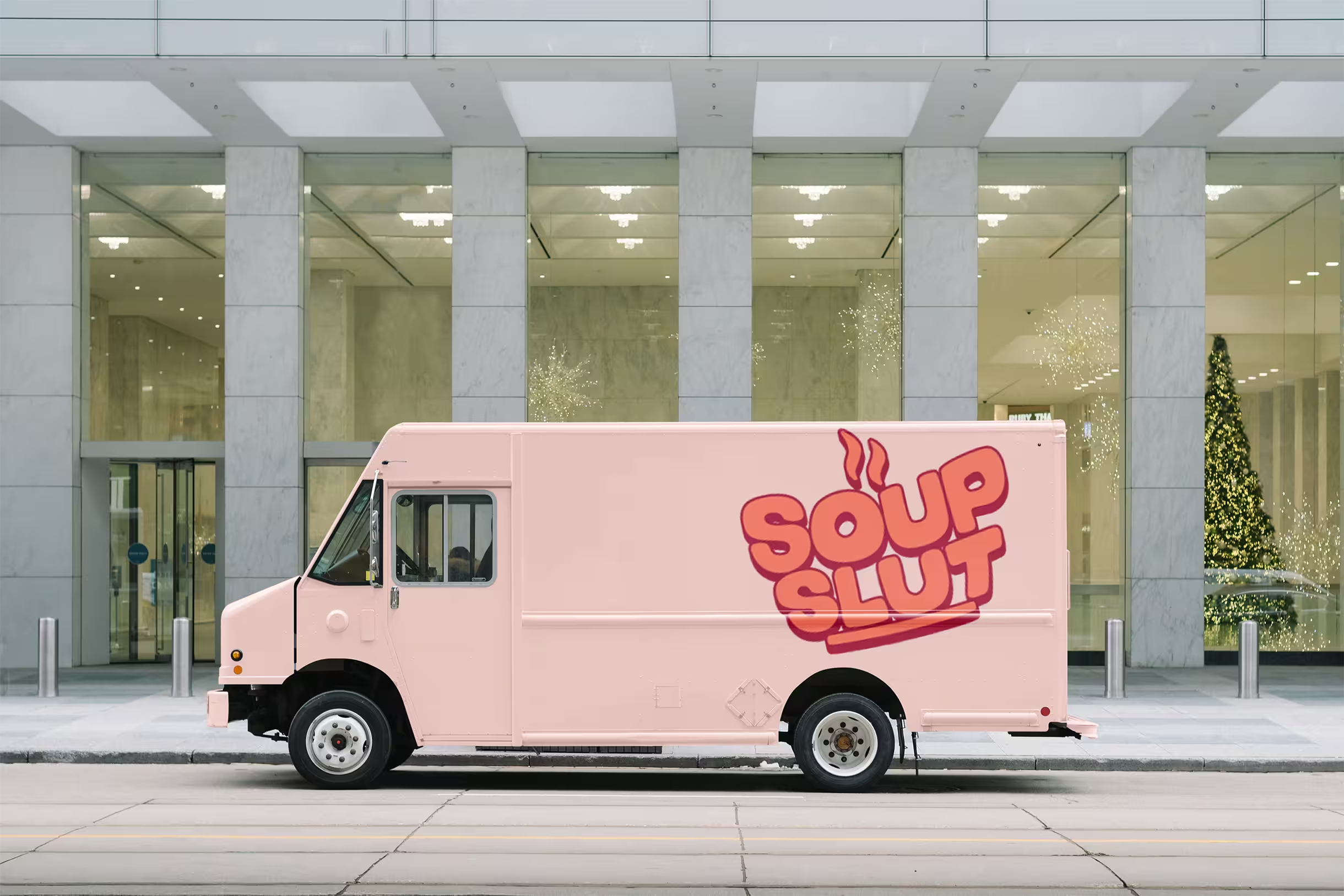
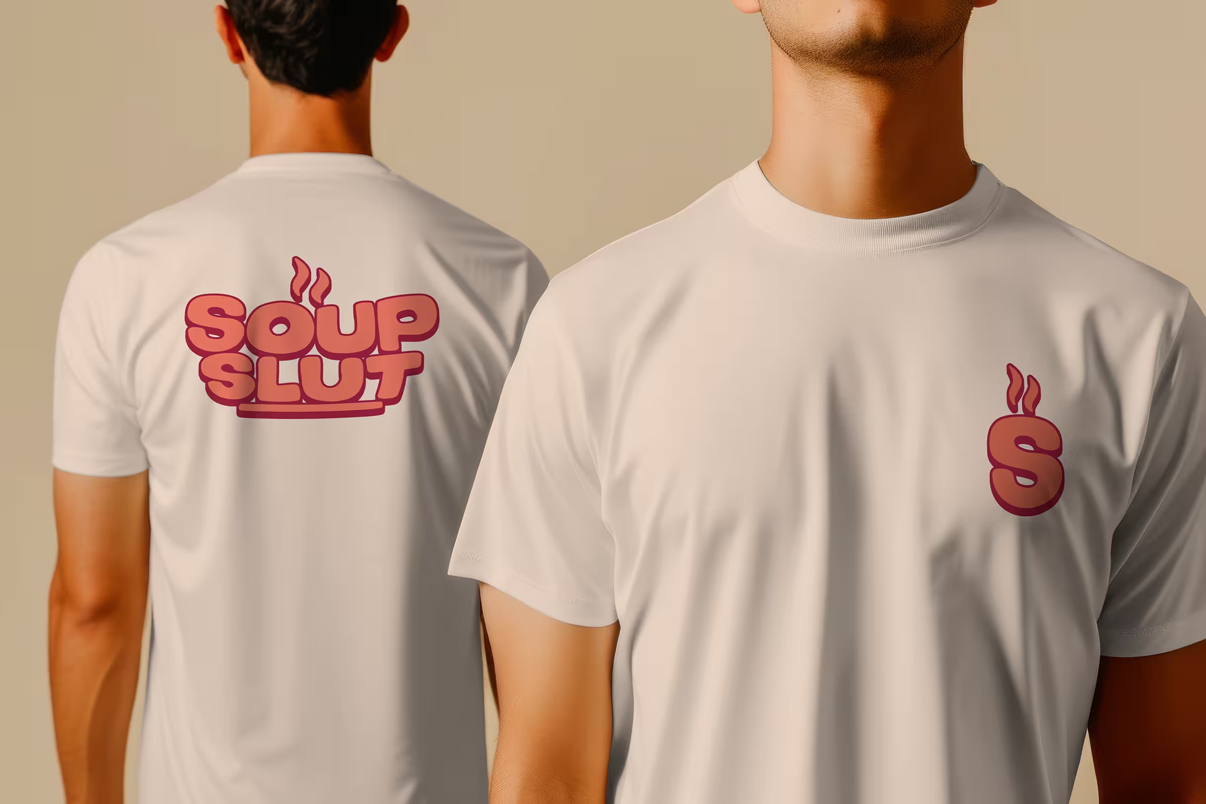
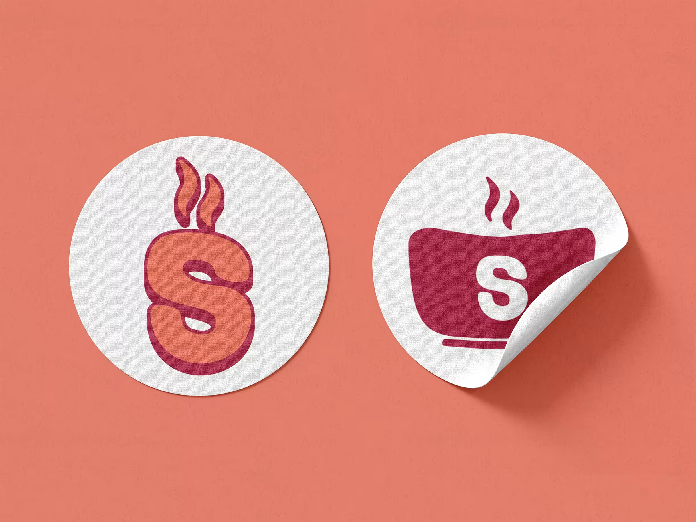
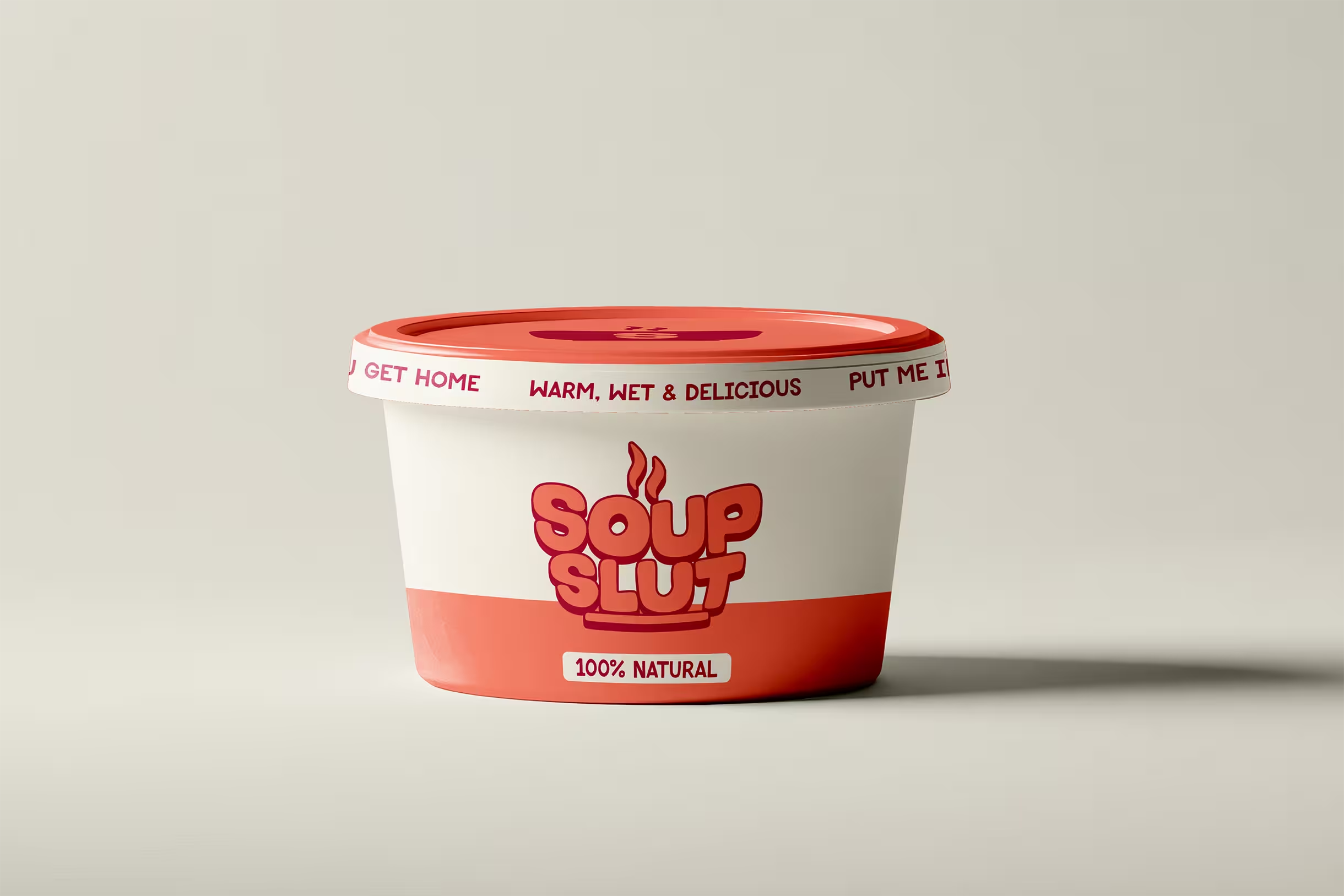
We started with typography, exploring font families until a few strong contenders emerged, then mocked up quick logo concepts to gut-check the direction early. Once a font family clicked, I took it to paper. Three hand-sketched logo options in grayscale, shown to the client before a single pixel was touched. We picked a direction, moved into Adobe for a full rendering, and then turned our attention to color. We pulled the palette directly from common soup ingredients, which gave the brand a warmth and authenticity that felt earned rather than chosen. The final deliverables included the primary logo, multiple variations, social icons, and concept art. A complete brand toolkit ready to show up and stand out.